


INTRO
BALAZS VEKES
Brand Art & Digital Design
INTRO
BALAZS VEKES
Brand Art & Digital Design
HL
HL
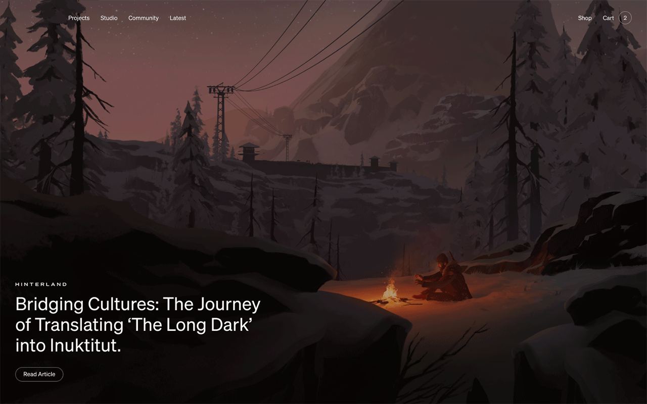


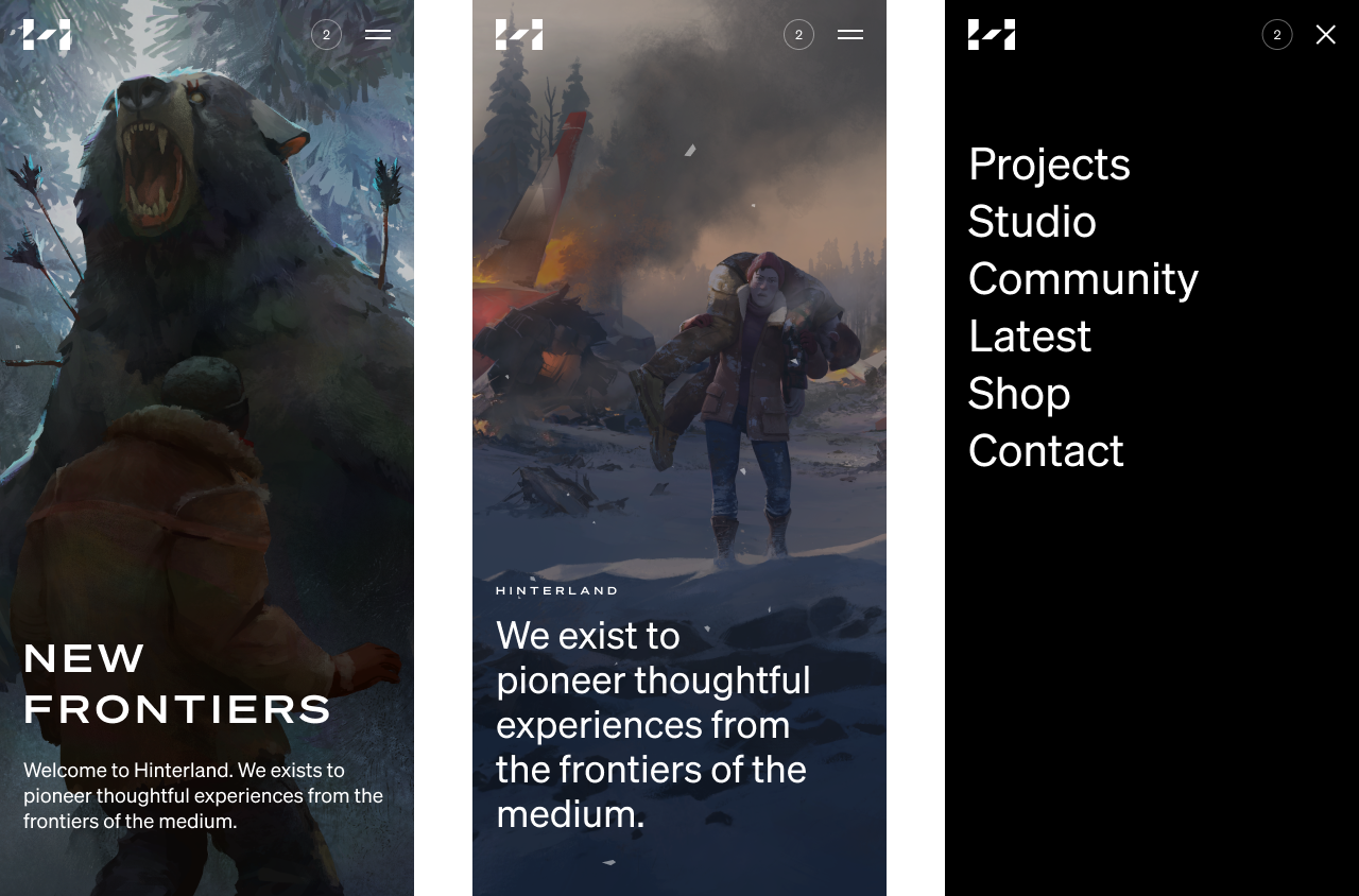


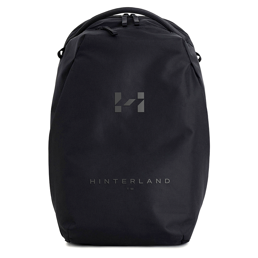

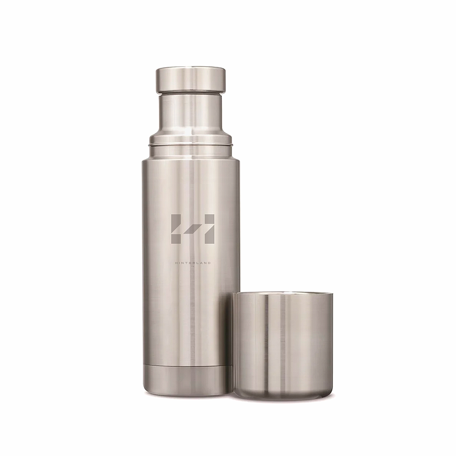


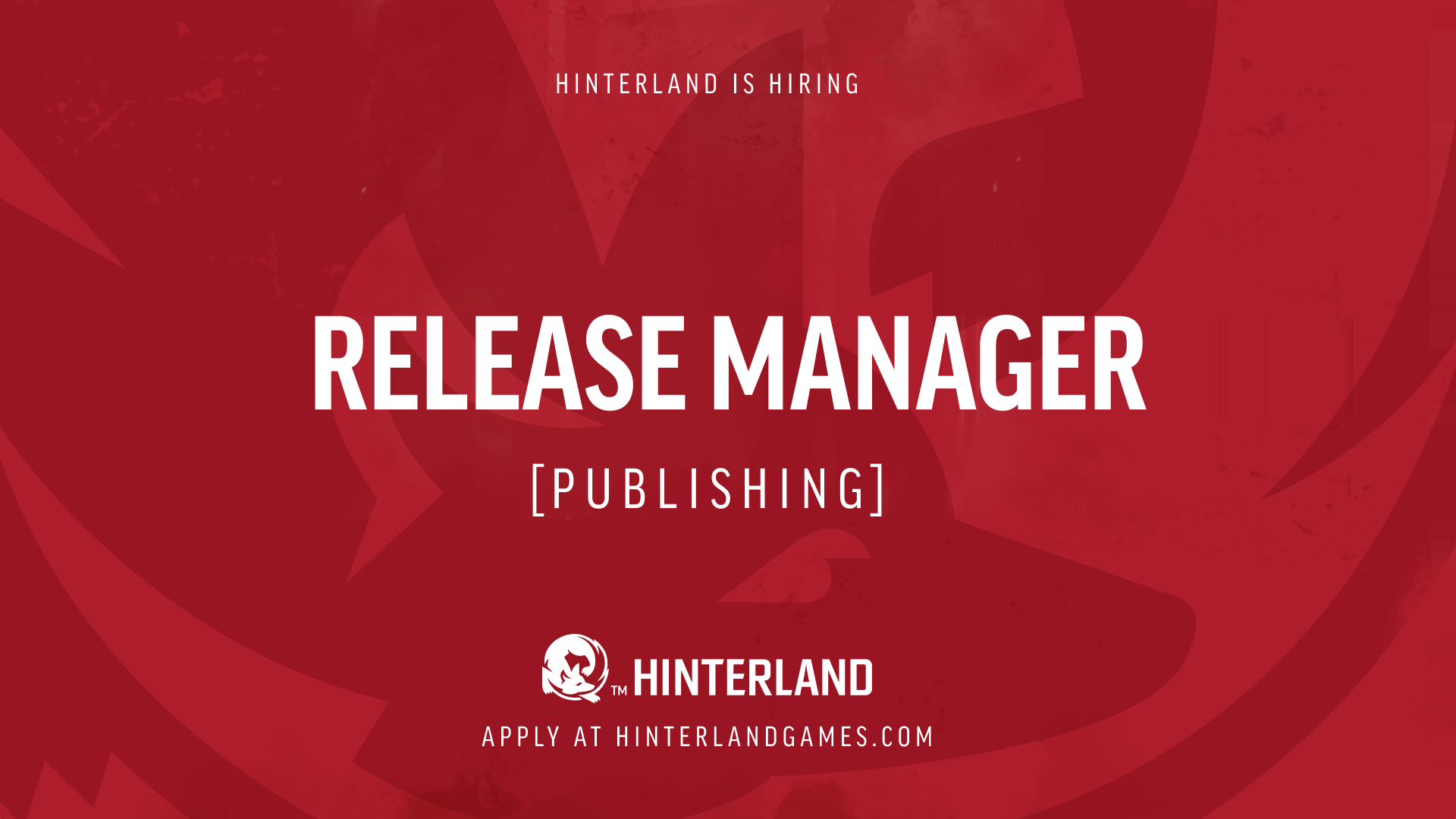
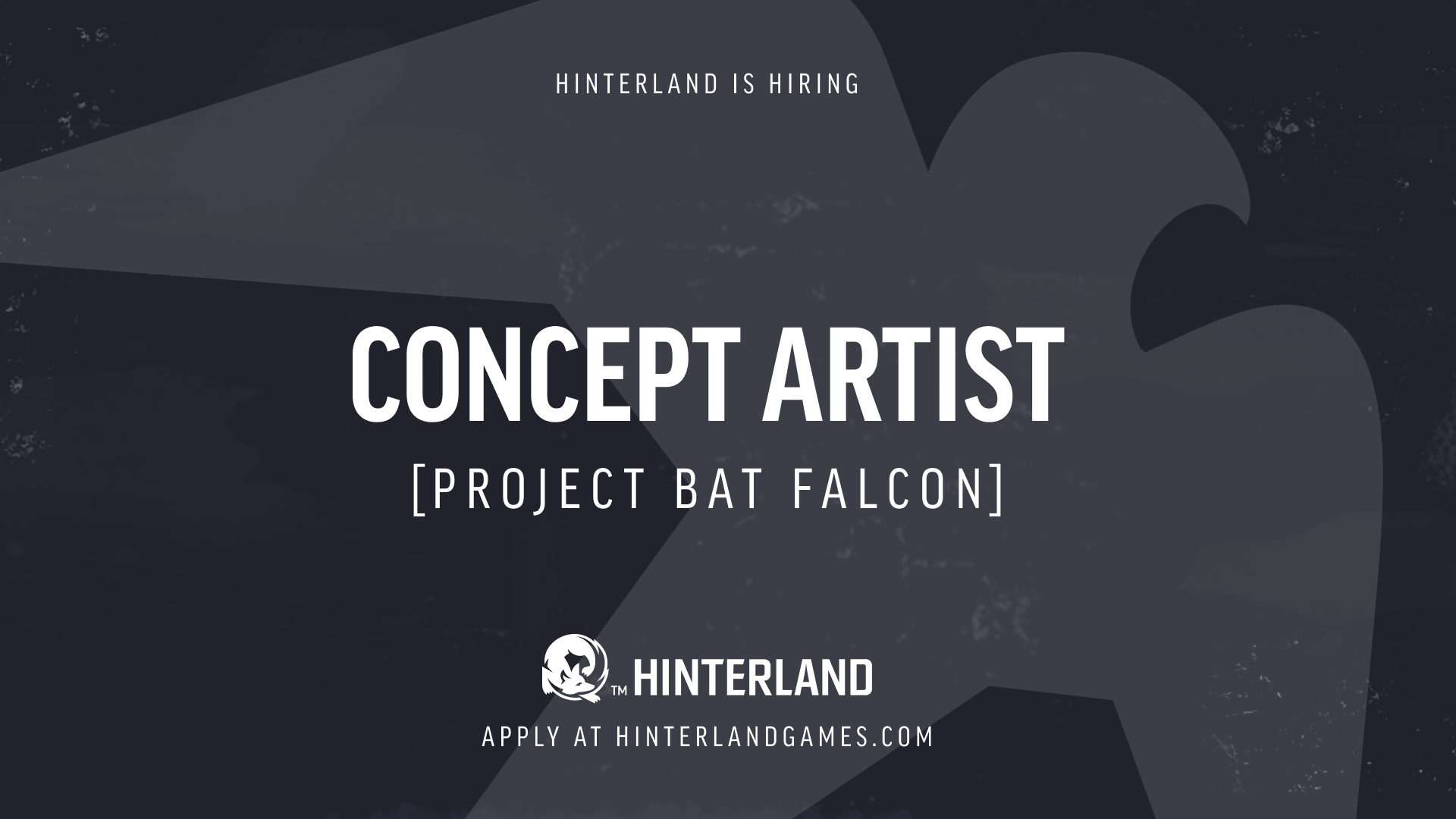
Hinterland Rebrand
BRANDING ・ GRAPHIC DESIGN ・ MERCHANDISE DESIGN ・ WEB DESIGN STYLE GUIDES ・ ART DIRECTION (ANIMATION & WEB DESIGN)
The new identity reflects the evolution of Hinterland as a game developer, publisher, IP creator, and entertainment company over the past 12 years. Anchored by a new visual direction and site at hinterland.com, the new branding opens the door to the next phase of Hinterland’s growth, and sets the table for ambitious plans for the team, the studio, their projects, and their future within the broader entertainment industry. (The Founder’s Introduction)
In collaboration with Burnkit, Vancouver.
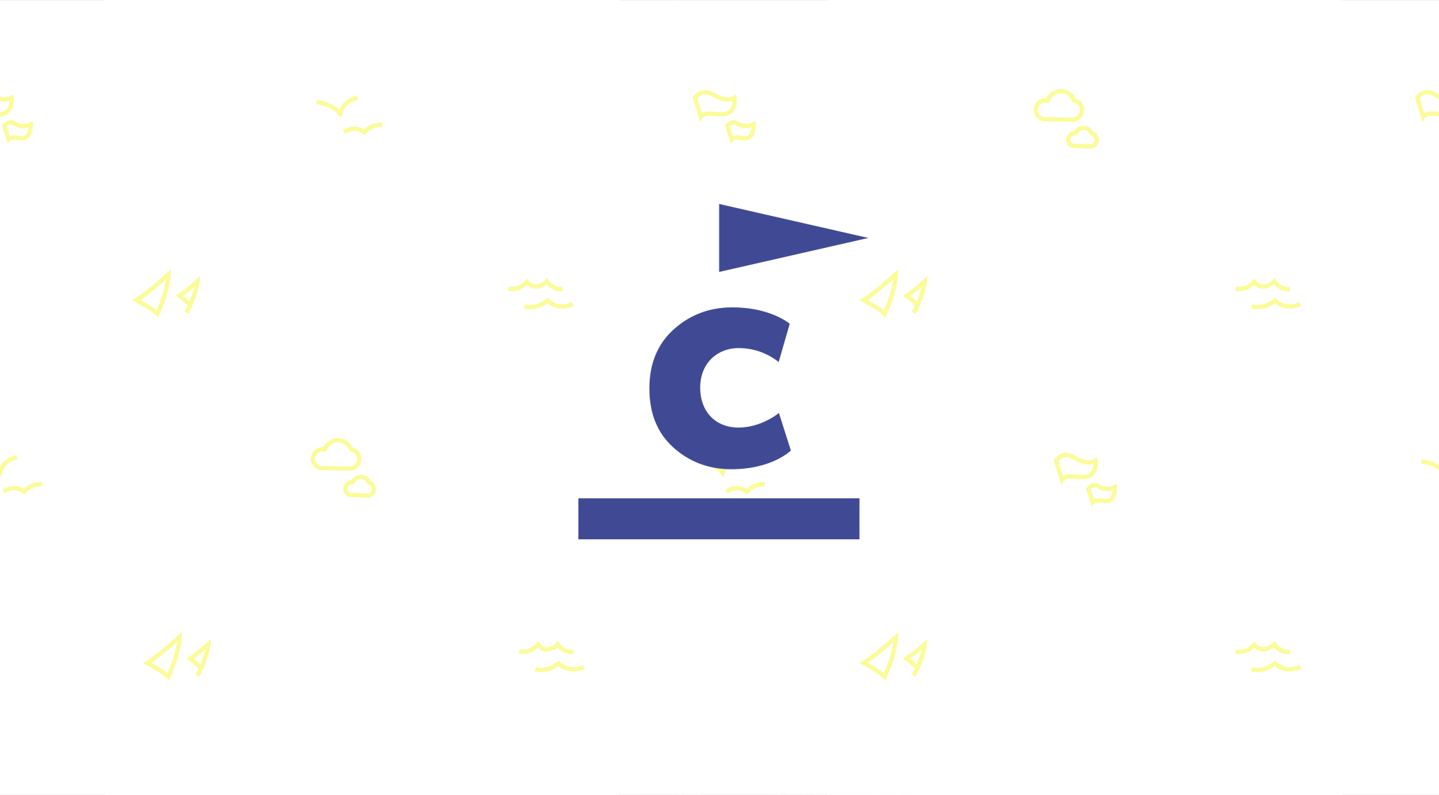
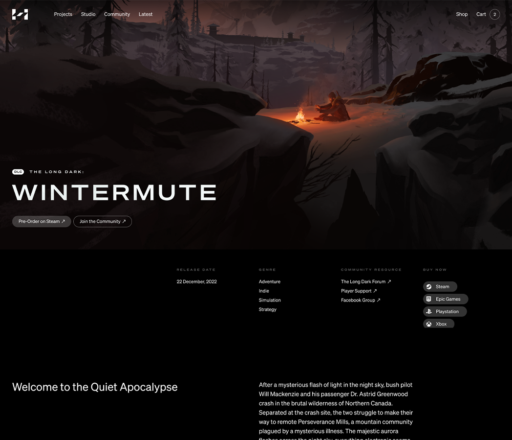
THE LONG DARK
THE LONG DARK


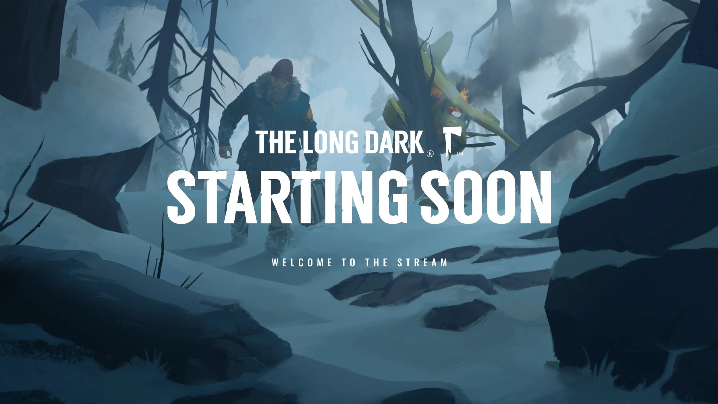
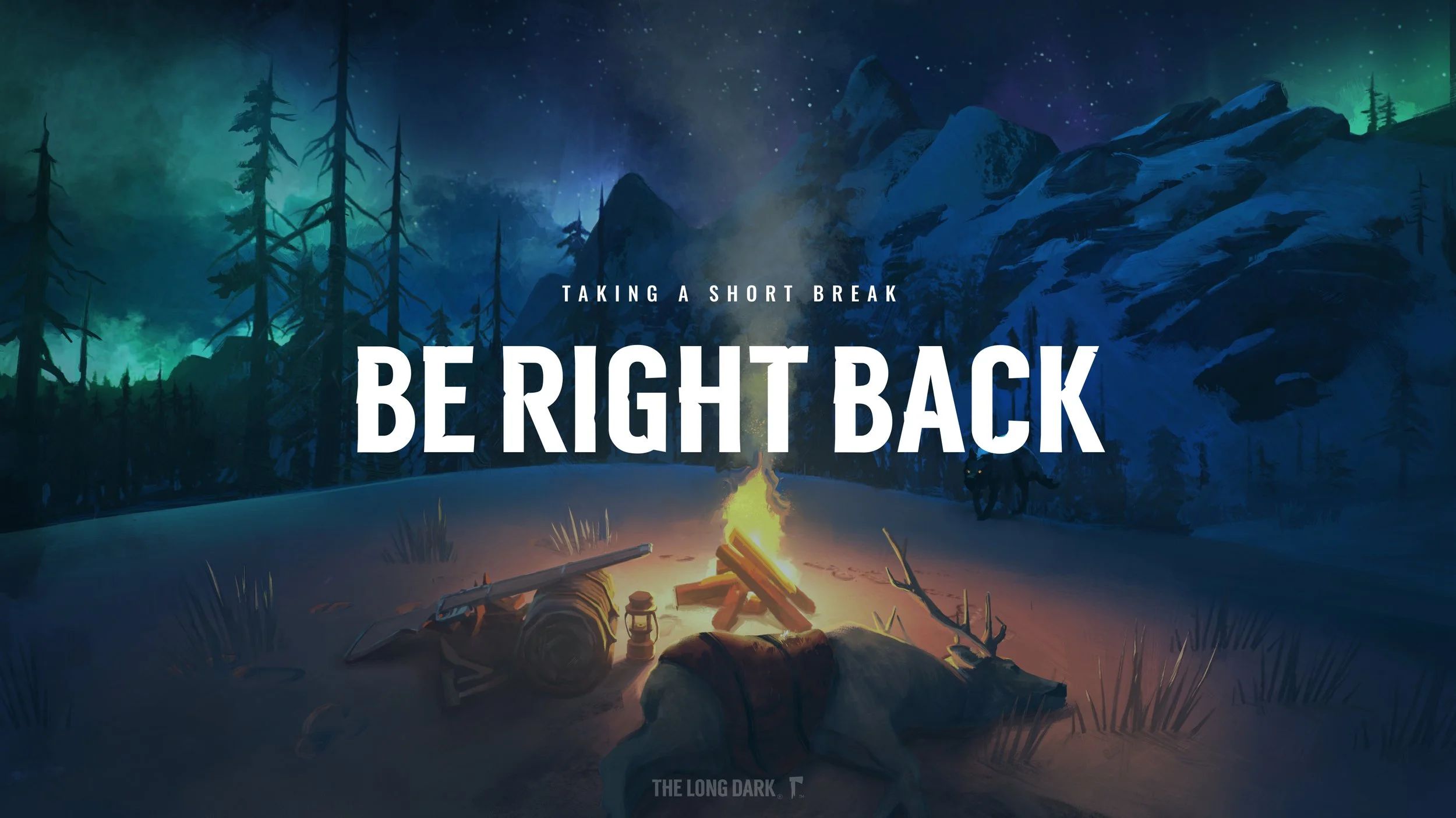
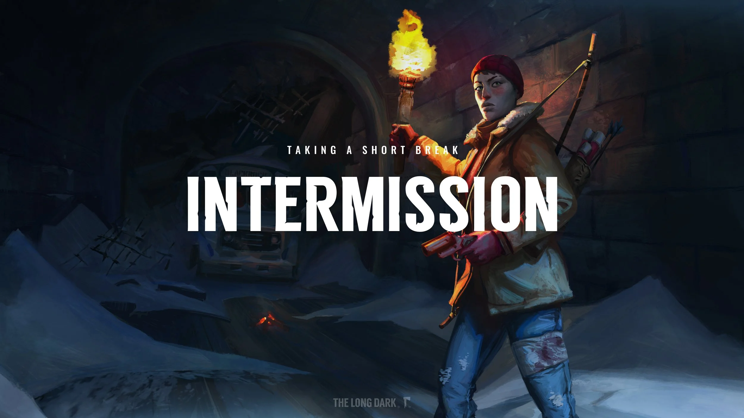
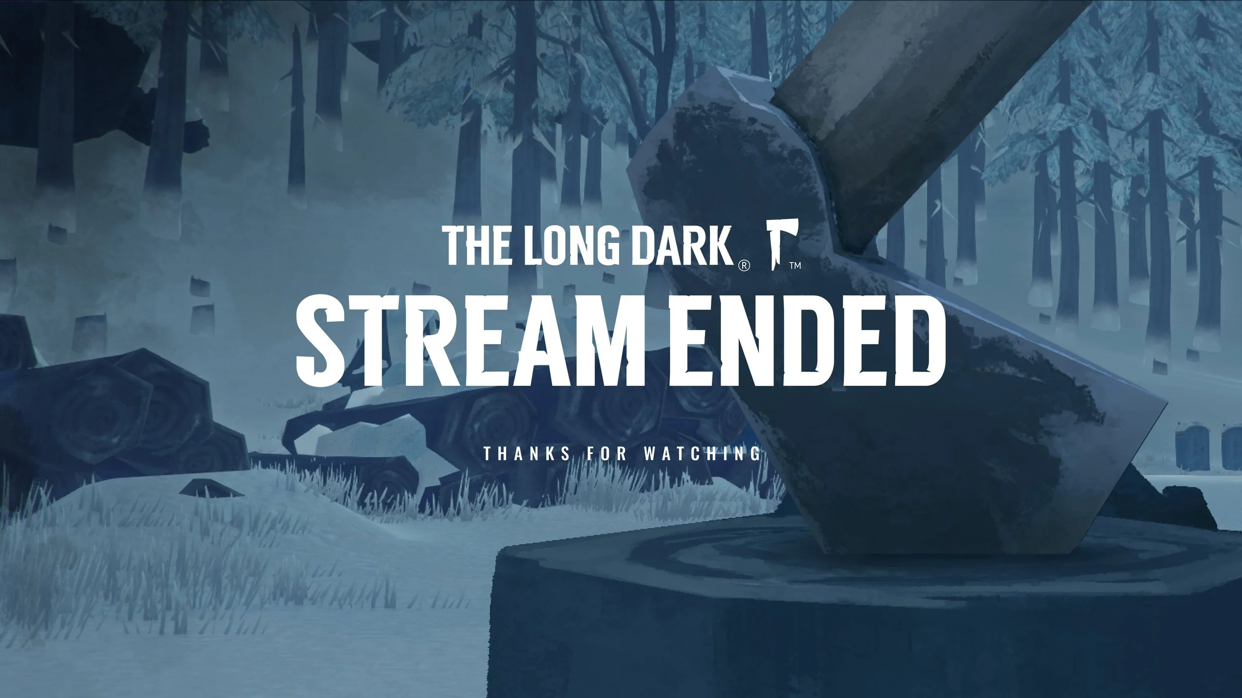


The Long Dark
BRANDING ・ TYPE DESIGN ・ MERCHANDISE DESIGN ・ ART DIRECTION
Hinterland’s flagship game, The Long Dark, is a thoughtful exploration-survival experience and one of the most popular and iconic Canadian video games ever made, with a cult following and millions of copies sold worldwide. Its visual identity is anchored by the hatchet symbol, supported by a custom headline font. These design elements have inspired countless fans to create art in the game’s style, from handmade artifacts to tattoos, knowing that wherever they go, the symbol will mean a lot to others around them as well.


CROWDSAIL COVER
CROWDSAIL COVER
CROWDSAIL
CROWDSAIL


Lean Principles
BRANDING ・ ICON & WEB DESIGN ・ COPYWRITING
The visual identity and landing page for Crowdsail, an online personal selling platform, were developed through a lean and budget-conscious process. In just a few days, a carefully considered yet flexible and expandable brand direction emerged. This approach enabled the startup's small development team to maintain its momentum and priorities.
ERIN CHAMBERS COVER
ERIN CHAMBERS COVER
ERIN CHAMBERS COVER 2
ERIN CHAMBERS COVER 2
ERIN CHAMBERS
ERIN CHAMBERS


A Custom Template
BRANDING ・ Typography ・ ILLUSTRATION ・ WEB DESIGN ・ INSTAGRAM TEMPLATES
The brand assets, website, and social content design for Erin Chambers Naturopathy were developed to equip the client with a starting kit of assets to manage her own social channels in the beginning phases of her business. By creating versatile templates, I enabled the generation of numerous variations from a relatively small number of original assets. This approach ensured an independent, cost-effective, and maintainable online presence with seamless scalability for future growth.
RADNOTI COVER
RADNOTI COVER
RADNOTI
RADNOTI


Radnóti Theatre
BRANDING ・ POSTER DESIGN ・ TYPOGRAPHY
The prestigious Budapest theatre is named after Miklós Radnóti, one of Hungary's most significant poets and literary figures of the 20th century, and a martyr of the Holocaust. The visual identity is inspired by a high-contrast concept of light and shadow, expressed across multiple layers in both the posters and the geometric icon. This design reflects the tragedy of the poet's life as well as the drama of the stage. Like in theatre, darkness is never empty, and the limelight often conceals more than it reveals.
HINTERLAND
HINTERLAND


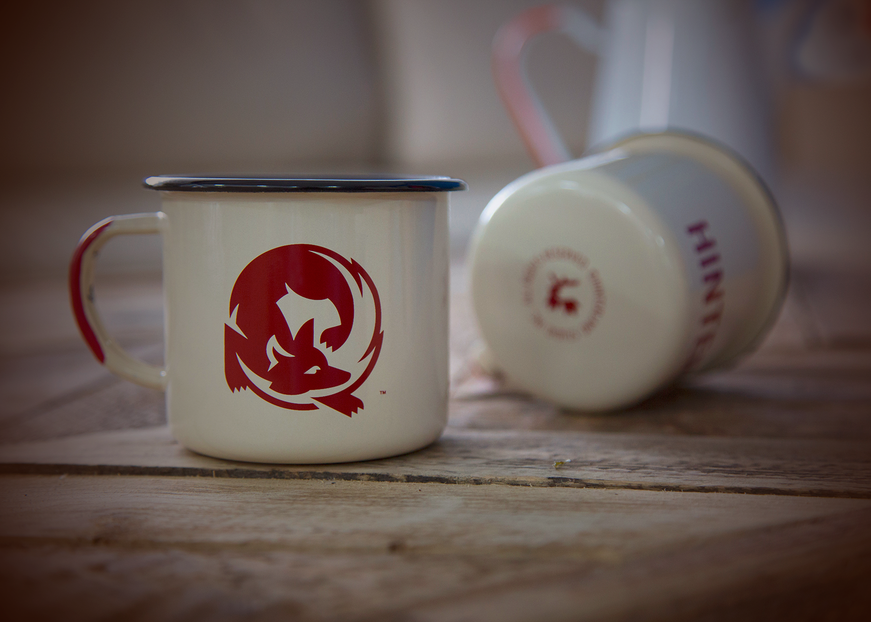


Hinterland
BRANDING ・ MERCHANDISE DESIGN ・ ART DIRECTION
Hinterland’s original visual identity was crafted to reflect the theme and mood of its first game, The Long Dark. Rooted in Canadiana, the circular fox motif became an early emblem of the studio, symbolizing the wilderness and the stories it seeks to tell.
SLIPWAY COVER
SLIPWAY COVER
SLIPWAY
SLIPWAY


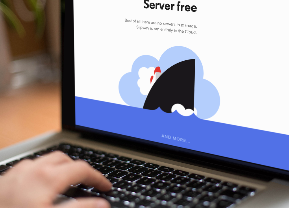

Build & Launch
BRANDING ・ VISUAL DESIGN ・ ILLUSTRATION
This dynamic and playful page was created to gauge the professional community's interest in Slipway, an innovative PaaS tool. Keen, detailed visuals were employed to build trust, create buzz, and generate early signups. The minimalist illustration style, vibrant colours, and bold headlines, supported by parallel-scroll animations, emphasize the product's simplicity and ease of use.
GIORGIA FONYODI COVER
GIORGIA FONYODI COVER
GIORGIA FONYODI
GIORGIA FONYODI


Foundations
BRANDING ・ TYPOGRAPHY
Confident and ambitious on a global scale, Giorgia Fonyodi is an emerging luxury label already making waves in the industry. Inspired by the most esteemed high-fashion brands and reflecting the collections' modestly extravagant style, the visual identity boasts pure, enduring elements. The timeless symbol and custom typeface are crafted to serve as the cornerstone for a fashion brand with boundless scalability.
Photography by Mark Viszlay.
THE GARAGE SALE
THE GARAGE SALE

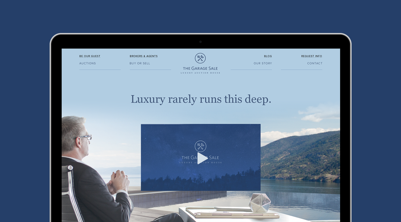


The Garage Sale
BRANDING ・ WEB DESIGN
A visually sophisticated and multifunctional website serving as both a sales and marketing tool and an information hub for a luxury real estate auction firm. The key and gavel elegantly symbolize the essence of this activity.
Web design created under the direction of The Still Brandworks in Vancouver.
ARC
ARC


Arc Energy Marketing
BRAND DEVELOPMENT ・ ART DIRECTION (ANIMATION, WEB DESIGN)
In collaboration with The Still Brandworks.
NODEFLY
NODEFLY

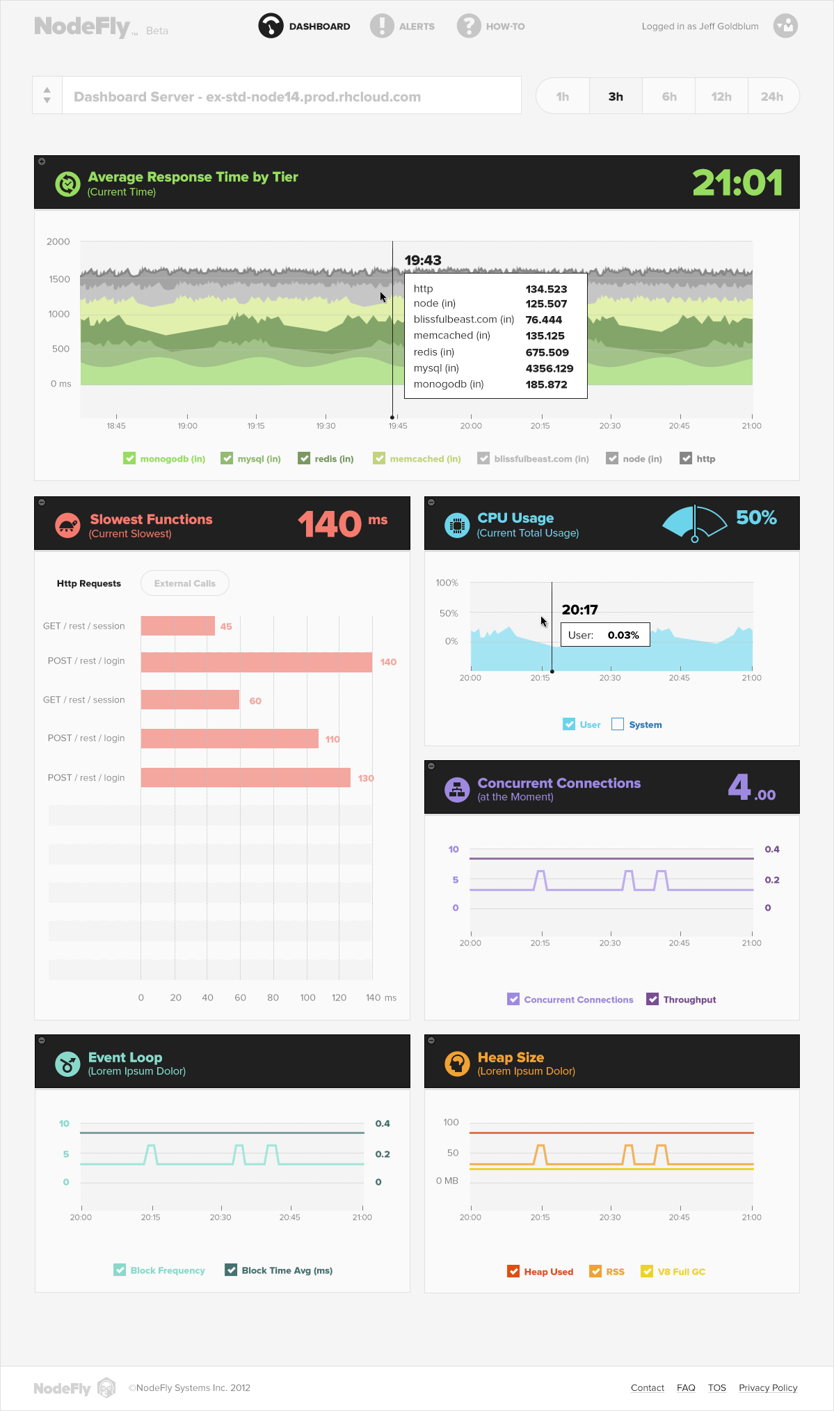
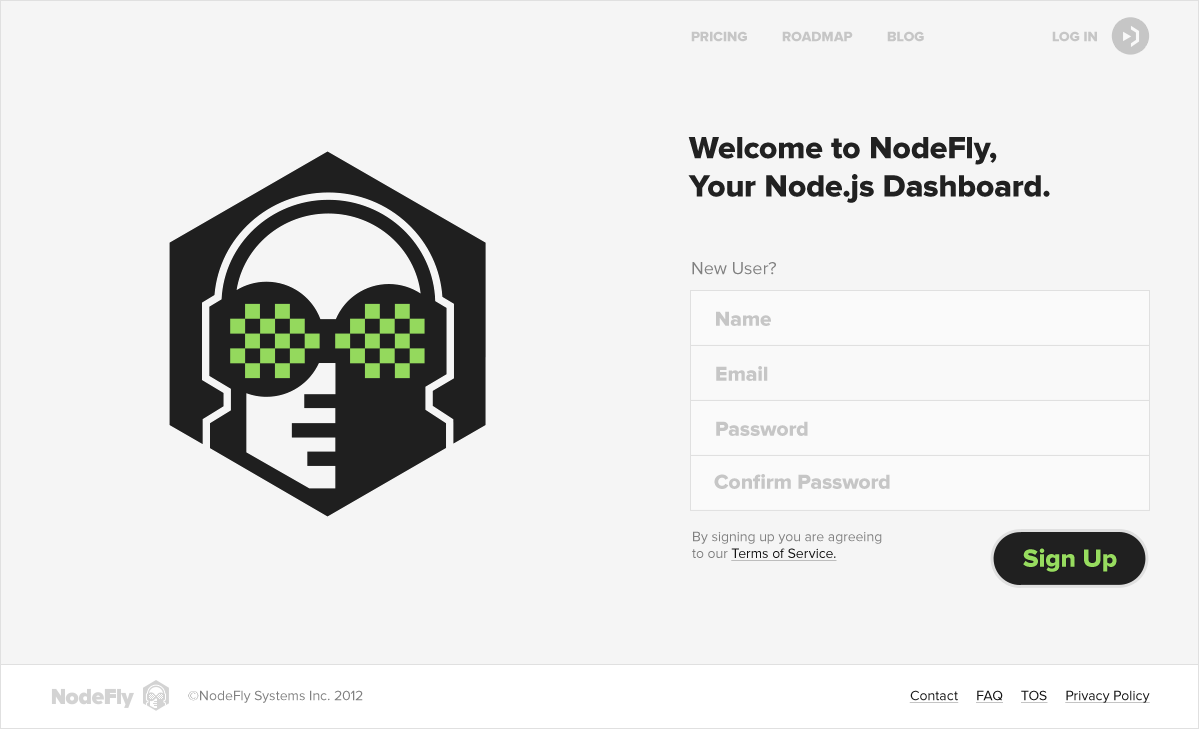
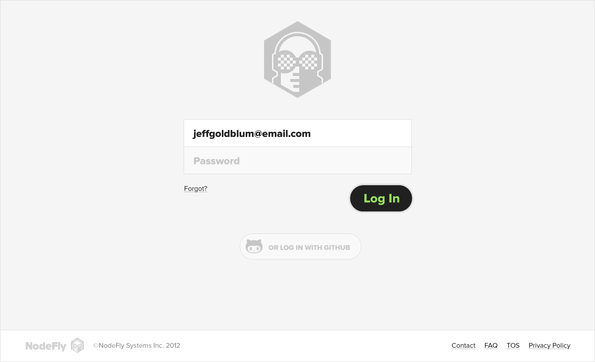

Fly on The Wall
BRANDING ・ PRODUCT DESIGN ・ ICON DESIGN
Nodefly, a real-time Node.js monitoring application, was completely redesigned and rebranded to elevate its market presence. This transformation enabled Nodefly to become an essential tool in the industry, leading to its acquisition by IBM's StrongLoop just a year later.
EURIKA
EURIKA


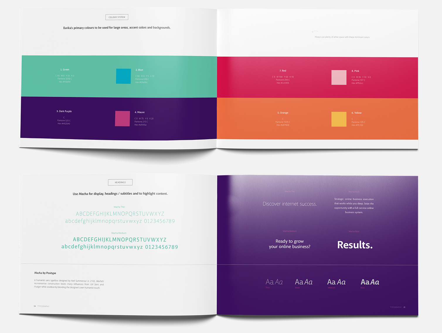

Validation
BRANDING ・ BRAND GUIDE ・ WEB DESIGN
This extensive project, born from thorough teamwork, encompassed branding and content strategy, a sales site, animations, and a dynamic video platform. We assisted Eurika in defining and targeting their audience effectively. With a validated concept, the resulting documentation serves as both an asset for fundraising and a guide for future endeavors. Eurika is dedicated to supporting small businesses with modest budgets, helping them thrive in a competitive online landscape.
In collaboration with The Still Brandworks, Vancouver.
CAREVILLE
CAREVILLE

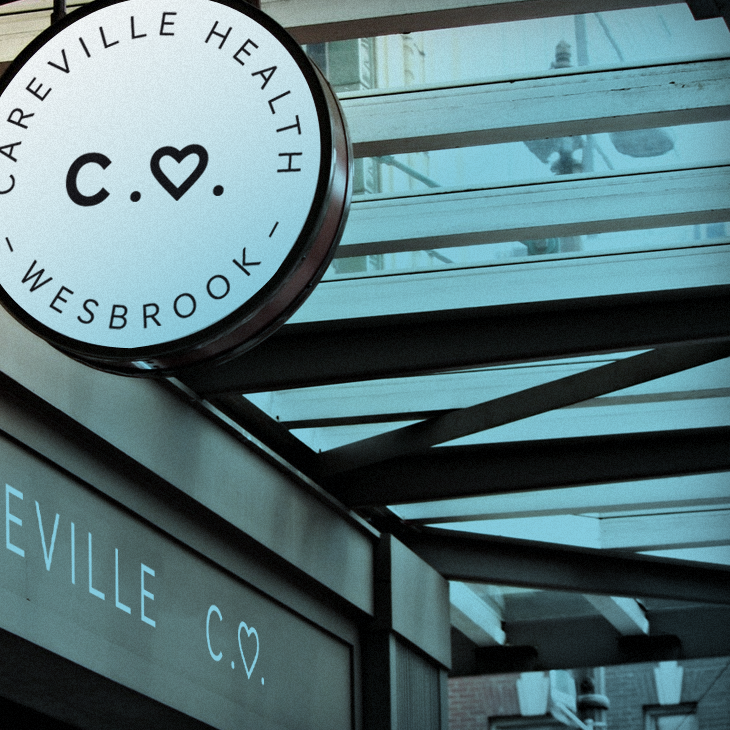
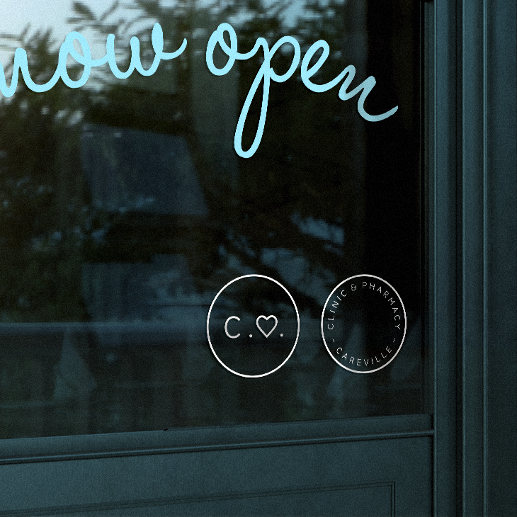
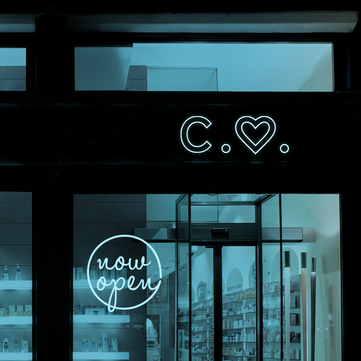
Careville Pharmacy
BRANDING ・ TYPOGRAPHY ・ SIGNAGE
SEVENTAILS
SEVENTAILS


